
Text vs. Graphics: Finding Balance in Resume Design
Learn how to balance text and graphics in your resume design to enhance readability and appeal across different industries.
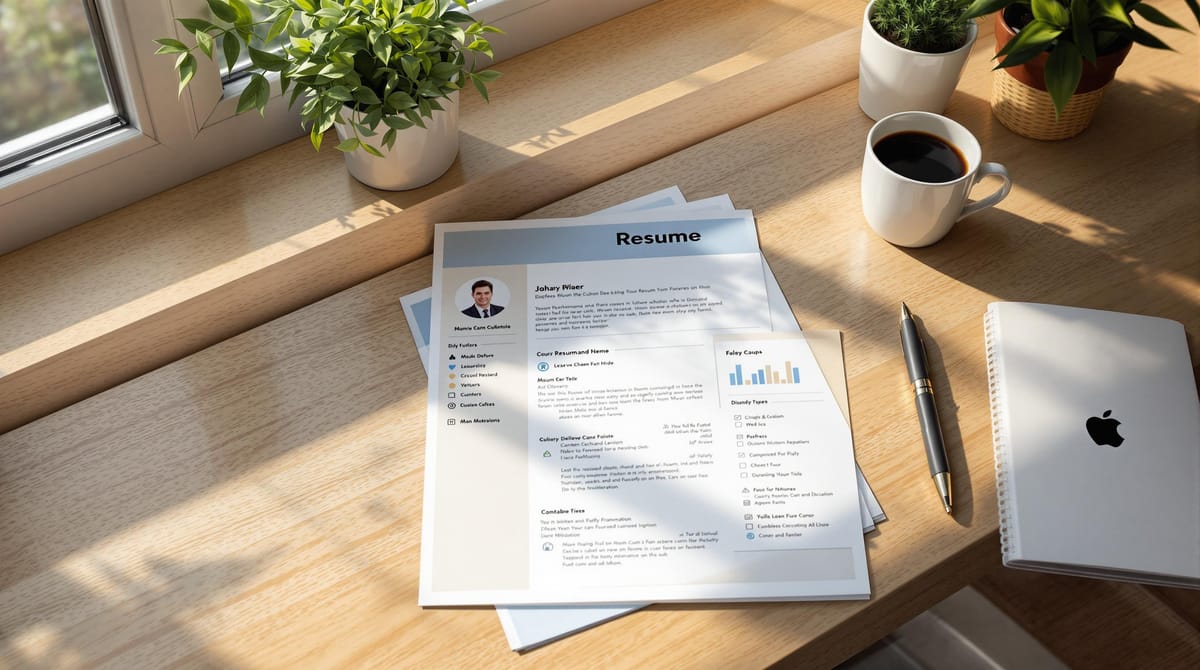
Your resume is your first impression. To stand out, balance text and visuals based on your industry. Here's how:
- Text-Heavy Resumes: Best for finance, law, healthcare. Focus on clear content, ATS compatibility, and easy updates.
- Graphic-Enhanced Resumes: Ideal for creative fields. Use visuals sparingly to highlight skills without overwhelming.
- Blended Designs: Works for tech roles. Combine modern fonts, progress bars, and icons with clear text.
Quick Comparison
| Industry | Best Style | Key Features |
|---|---|---|
| Creative Fields | Visual-heavy | Colors, branding, portfolio thumbnails |
| Conservative Fields | Text-focused | Simple layout, classic fonts, subtle dividers |
| Tech Sector | Blended design | Progress bars, icons, modern fonts |
Keep your resume clean, professional, and tailored to your field. Use tools like Word, Canva, or InDesign to create a polished format that highlights your strengths.
Should You Use Graphics On Your Resume? [Recruiter Tips]
Text-Based Resumes: Core Strengths
Text-based resumes are a go-to choice for applications in fields like finance, healthcare, and law. Their straightforward layout and clear presentation make them highly effective in these industries.
Making Resumes ATS-Friendly
To ensure your resume is compatible with Applicant Tracking Systems (ATS), keep the formatting simple and clear. Here are some tips:
- Use standard headings like "Experience", "Education", and "Skills"
- Include keywords directly from the job description
- Avoid overly complex designs or formatting that might confuse ATS software
- Stick to readable fonts like Arial, Calibri, or Times New Roman
Highlighting Key Information
A text-based format naturally draws attention to your qualifications without unnecessary distractions. Organize your resume to emphasize these critical sections:
| Section | What to Include |
|---|---|
| Professional Summary | Your role, experience, and top achievements |
| Work Experience | Companies, job titles, dates, and measurable results |
| Skills | Technical expertise, soft skills, and certifications |
| Education | Degrees, institutions, graduation dates, and honors |
This style is particularly effective in industries where decision-makers prioritize clarity and professionalism over flashy designs.
Easy to Update and Customize
One major advantage of text-based resumes is how quickly you can adjust them:
- Tailor keywords and experiences for specific job openings
- Create multiple versions for different roles with minimal effort
When customizing, focus on reorganizing your skills and achievements to match the job description. This text-first strategy sets the stage for adding visual elements, which we’ll discuss in the next section.
Adding Graphics to Resumes
While text-based resumes are straightforward and work well with ATS (Applicant Tracking Systems), adding selective graphics can make your resume stand out visually. When used thoughtfully, visuals can complement your content and highlight your key strengths.
At scale.jobs, we understand the importance of balancing text and visuals to leave a strong impression. Use graphics sparingly to draw attention to your most important qualifications. Make sure any visual elements fit within a clean and well-structured layout.
Up next, we'll look at how to blend text and graphics effortlessly.
Combining Text and Graphics
Merging text and graphics effectively can make your resume stand out while maintaining clarity. The best resumes strike a balance between concise content and thoughtful visuals.
Tailoring Design to Your Industry
Resume design expectations vary by industry. Here's how to align your design with specific fields:
Creative Fields: Roles in graphic design, art, or marketing can benefit from more visual flair:
- Use 2-3 complementary colors for accents
- Add a personal logo or branding element
- Include portfolio thumbnails
Conservative Industries: Fields like finance, law, and healthcare call for more traditional designs:
- Stick to text-heavy layouts
- Use subtle divider lines for organization
- Choose classic fonts like Georgia or Garamond
- Opt for dark blue or gray accents
Tech Sector: For software development or IT roles, a mix of design and functionality works well:
- Use progress bars to show technical skills
- Add icons for programming languages
- Select modern fonts like Open Sans or Roboto
Once tailored to your industry, ensure the overall layout is clean and professional.
Keeping Resumes Clear and Professional
Graphics can enhance readability if used correctly. Here's how to maintain clarity:
Layout Structure
- Stick to a consistent grid
- Use margins between 0.75 and 1 inch
- Balance white space in sections
- Limit text blocks to 4-5 lines
Visual Hierarchy
- Use headers (14-16pt) and body text (10-12pt)
- Bold section titles for emphasis
- Add divider lines for clear separation
- Align all elements to the grid
Once your layout is set, choose the right tools to bring your design to life.
Tools for Designing Resumes
The right software can simplify creating a polished resume. Here's a quick comparison:
| Software Type | Best For | Key Features |
|---|---|---|
| Microsoft Word | Traditional formats | Built-in templates, ATS-friendly, easy editing |
| Adobe InDesign | Creative designs | Professional layouts, advanced typography |
| Canva | Quick designs | Pre-made templates, user-friendly, free options |
Tips for Using Design Software:
- Save your resume in both PDF and .docx formats
- Test how it looks on different devices
- Embed fonts in your PDF to keep formatting intact
- Keep file size under 2MB
Visual elements should enhance your resume, not distract from your qualifications. Aim for a design that highlights your expertise while remaining professional and easy to read.
Professional Design Tips
Once you've nailed the content of your resume, focus on polishing its design to make it stand out.
Fonts and Layout Basics
Follow these typography and layout guidelines to keep your resume looking polished and professional:
Font Selection
- Stick to clean, easy-to-read fonts like Arial, Helvetica, or Calibri for wide compatibility.
- Use 10-12pt for body text and 14-16pt for section headers.
- Limit yourself to two fonts - one for headers and another for body text.
- Avoid overly decorative fonts like Comic Sans or Script styles.
Layout Structure
- Set line spacing to 1.15 for better readability.
- Align text to the left for a clean, professional look.
- Clearly divide sections for easy navigation.
- Stick to either a single-column or two-column layout.
Using Blank Space
Proper use of blank space makes your resume easier to read and visually appealing.
Spacing Guidelines
- Use 10-18pt spacing to separate sections and headers.
- Allow 6-8pt spacing between bullet points.
- Distribute text evenly across the page to avoid overcrowding.
Content Distribution
- Organize the page into distinct vertical or horizontal sections.
- Limit your design to two columns for simplicity.
- Group related information together to maintain logical flow.
- Add visual breaks between major sections for clarity.
Once your layout and spacing are in place, consider subtle personal touches to give your resume a polished look.
Adding Personal Style
Color Usage
- Use up to two accent colors for a professional appearance.
- Stick to muted tones like navy, dark gray, or burgundy.
- Apply color sparingly - reserve it for section headers or dividing lines.
- Keep body text in black for maximum readability.
Design Elements
- Add thin divider lines (0.5-1pt) for a clean, organized look.
- Include a professional headshot only if it's relevant for your field.
- Consider creating a personal logo or monogram, especially for creative roles.
- Use icons sparingly, keeping them small (16x16px max).
Consistency is key - ensure your bullet points, date formats, and other design elements are uniform throughout. A well-designed resume not only looks professional but also highlights your qualifications effectively.
Conclusion: Building Your Best Resume
A strong resume strikes the right balance between clear text, professional visuals, and ATS compatibility. Keep in mind that different industries have unique expectations - what works for a graphic designer might not be ideal for a financial analyst.
Research shows that a well-thought-out resume design can significantly improve job search outcomes. For instance, 93% of scale.jobs customers secured full-time roles within three months.
Here are some key tips to guide your resume creation:
- Make it ATS-friendly: Keep your main content in text format, using visuals sparingly to complement rather than overwhelm.
- Ensure consistency: Stick to the same fonts, design elements, and spacing throughout.
- Prioritize readability: Use clean typography and plenty of white space to make your resume easy to scan.
- Tailor to your industry: Adjust the balance of text and visuals depending on your field’s norms.
To simplify the process, consider using tools like scale.jobs' Resume ATS Checker to ensure your resume meets these standards. As one user, Shobhit Datta, shared on Trustpilot:
"Scale.jobs has been an excellent help in applying for high volume of jobs which otherwise would be very time consuming... This is extremely useful in the current job market as a high-volume approach helped me get few interview calls which I wasn't getting earlier".
Modern resumes combine timeless professionalism with a touch of modern design. By focusing on both content and presentation - and taking advantage of helpful tools - you can create a resume that highlights your strengths and grabs the attention of hiring managers.