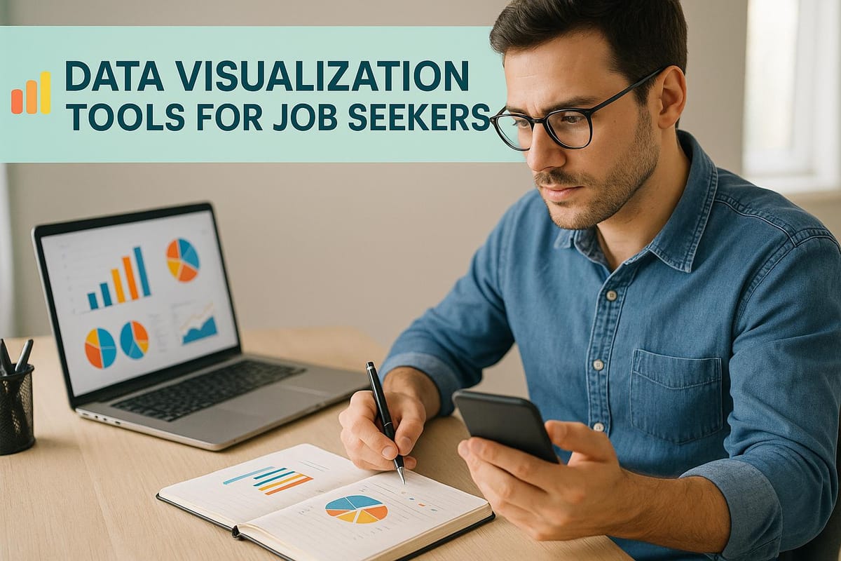
Data Visualization Tools for Job Seekers
Explore essential data visualization tools that can enhance your job applications, showcasing your skills and achievements effectively.
In today’s competitive job market, using data visualizations in your resume, portfolio, or LinkedIn profile can help you stand out. Visual tools like dashboards, charts, and graphs make it easier to showcase your achievements, technical skills, and career milestones in a clear, engaging way. Here's a quick overview of the best tools for job seekers:
- Tableau Public: Ideal for interactive dashboards, perfect for analytics and marketing roles. Free to use but publicly accessible.
- Power BI: Great for corporate roles with seamless Microsoft integration. Free desktop version available.
- Google Looker Studio: Beginner-friendly, connects with Google tools, and works well for marketing and small business roles.
- Python Libraries (Matplotlib, Seaborn, Plotly): Advanced coding options for data science and technical roles.
- Excel: A must-have tool for basic visualizations, widely used across industries.
To make the most of these tools:
- Create ATS-friendly resumes alongside visually enhanced versions.
- Use portfolios to demonstrate analytical projects and results.
- Leverage LinkedIn to feature dashboards, infographics, and skills.
Quick Comparison:
| Tool | Best For | Cost | Learning Curve | Key Features |
|---|---|---|---|---|
| Excel | General business, finance | $7–$22/month | Low | Pivot tables, simple visuals |
| Tableau Public | Analytics, marketing | Free | Medium | Interactive dashboards |
| Power BI | Corporate roles | Free–$10/month | Medium | Microsoft integration |
| Google Looker Studio | Marketing, small business | Free | Low | Google ecosystem integration |
| Python Libraries | Data science, research | Free | High | Advanced customization |
For tailored job applications, platforms like Scale.jobs can help optimize resumes for ATS systems while showcasing your visualization skills effectively.
7 Best Data Visualization Tools 2025 (Full Software Demo & Comparsion)
Best Data Visualization Tools for Job Seekers
The right data visualization tool can turn a plain resume into a standout asset. Each tool caters to different skill levels and career goals, so knowing their strengths can help you choose the right one for your needs. Pairing these skills with platforms like scale.jobs can give you a competitive edge in the job market.
Let’s break down the strengths of these tools and how they align with various career paths.
Tableau: Crafting Professional Dashboards
Tableau is a go-to for creating interactive dashboards and telling compelling data stories. Its free version, Tableau Public, is perfect for building a portfolio that grabs attention.
With Tableau Public, you can design dashboards that are easy to share online - an excellent feature for roles in data analysis, business intelligence, or marketing where visualization skills are highly valued. Its user-friendly drag-and-drop interface means no coding is required, but mastering advanced features like calculated fields and parameters can help you stand out.
One thing to keep in mind: work created in Tableau Public is publicly accessible, so it’s best suited for personal projects or open datasets. For those looking for a budget-friendly corporate tool, check out Power BI.
Microsoft Power BI: Affordable for Corporate Roles
Power BI is a strong choice for professionals targeting corporate positions in finance, operations, and business analysis. Its seamless integration with Microsoft Office products makes it a favorite among top companies.
Power BI Desktop is free, allowing you to create reports locally that can double as portfolio pieces or static visuals for your resume. If you’re exploring other no-cost options, Google Looker Studio is another tool worth considering.
Google Looker Studio: Beginner-Friendly and Free
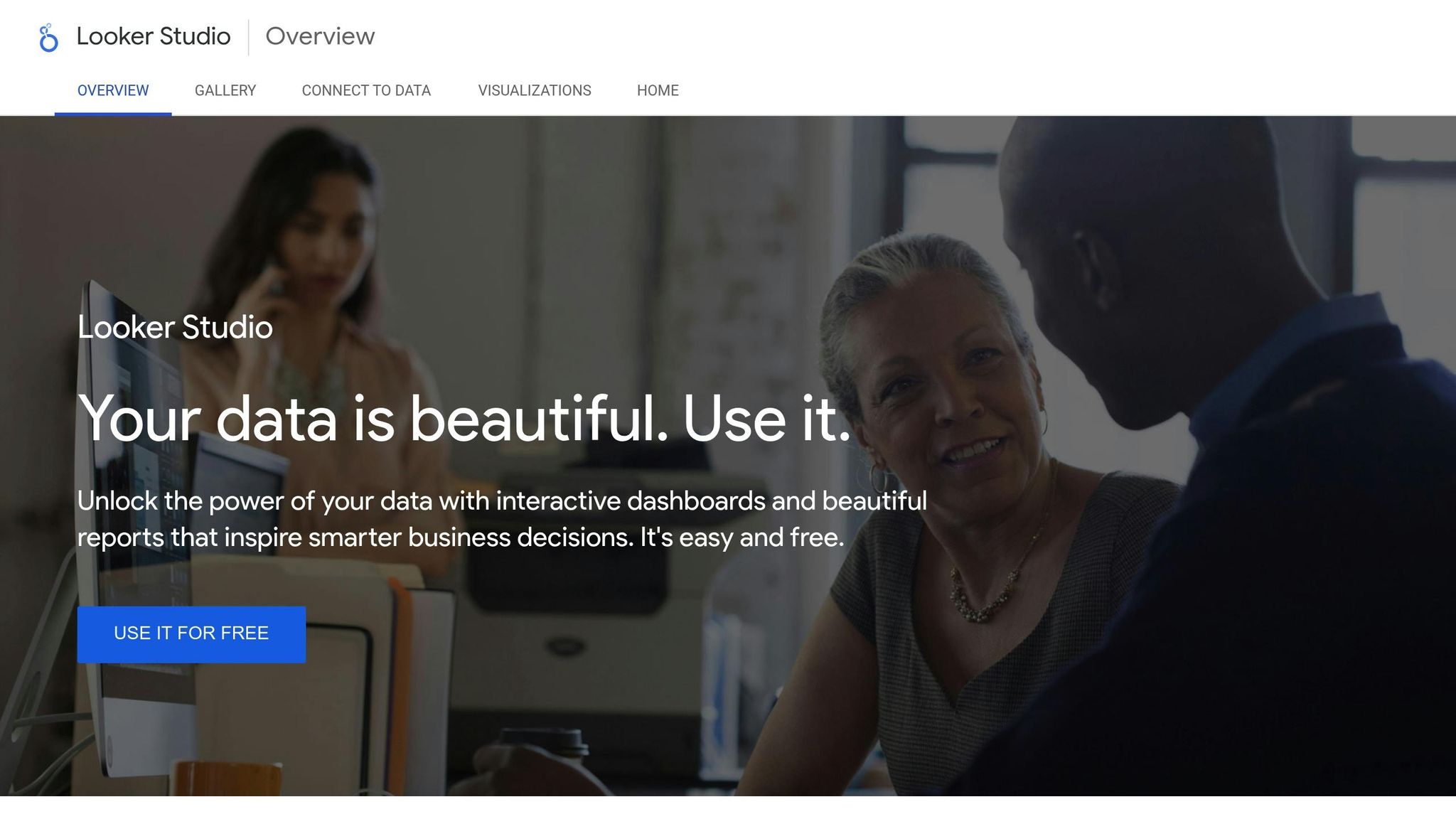
Google Looker Studio (formerly Data Studio) is a cost-free tool that delivers polished, professional visuals. It connects effortlessly with Google tools like Analytics, Ads, and Sheets, making it especially valuable for marketing and digital-focused roles.
With pre-built templates and easy sharing options, Looker Studio allows beginners to create dashboards quickly. Its web-based platform means you can work from anywhere, making collaboration straightforward without the need for complex software setups. For those aiming for more technical roles, Python libraries offer advanced customization options.
Python Visualization Libraries: Advanced Skills for Technical Roles
For data science and software engineering positions, using Python visualization libraries like Matplotlib, Seaborn, and Plotly can showcase your technical expertise and problem-solving abilities.
Matplotlib is ideal for creating clear, high-quality charts, while Seaborn enhances it with statistical visualizations favored by data scientists. Plotly adds interactive elements, making it a great choice for Jupyter notebooks or web applications.
Though these libraries require coding knowledge, they offer nearly limitless customization and integrate seamlessly with machine learning workflows. Including Python visualization projects in your GitHub portfolio can demonstrate the technical skills many employers seek. Still, don’t underestimate the power of Excel.
Excel: A Must-Have for Basic Visualization
Excel remains a staple across industries, making it an essential tool for almost every job. Its charting capabilities - like pivot charts, sparklines, and conditional formatting - are perfect for summarizing data and achievements.
Excel is especially useful for adding simple, effective visuals to resumes or creating one-page infographics that highlight your career milestones. Because most hiring managers are already familiar with Excel, including these visuals can immediately convey your analytical skills in a way that’s easy to understand.
Adding Data Visualizations to Your Job Search Materials
Incorporating data visualizations into your job search materials can set you apart by showcasing your technical expertise and creativity. Here's how you can make the most of these tools across your resume, portfolio, and LinkedIn profile.
Enhancing Resumes with Visual Dashboards
To make your resume stand out, consider creating two versions: one optimized for Applicant Tracking Systems (ATS) and another that includes visual elements like charts, graphs, or even a QR code leading to your digital portfolio. Since ATS software often struggles with processing visuals, the text-based version ensures your resume gets through initial screenings. For the visually enhanced version, use subtle design elements like color-coded metrics to draw attention to your key accomplishments without overwhelming the reader.
Showcasing Analytical Skills in Your Portfolio
Your portfolio is the perfect place to highlight your analytical abilities. Focus on projects that clearly outline your problem-solving approach and the tangible business results you achieved. Include data visualizations that demonstrate how your insights informed decisions or drove outcomes. This not only highlights your technical skills but also your ability to apply them effectively in real-world scenarios.
Adding Visual Flair to Your LinkedIn Profile
Leverage LinkedIn's features to showcase your expertise. Use the Featured section to highlight your best dashboards or infographics, and list relevant tools and skills in the Skills section. To tie it all together, design a custom banner that reflects your analytical strengths and professional brand. These visual touches can make your profile more engaging and reinforce your qualifications in a way that complements your overall job application strategy.
Picking the Right Data Visualization Tool for Your Job Target
When it comes to data visualization, choosing the right tool can make all the difference. The key is to align your choice with industry standards and the specific demands of your target role. Let’s break it down.
How to Match Tools to Job Roles
Different job roles prioritize unique aspects of data visualization. Here's what to keep in mind:
- Data Analytics and Business Intelligence: These roles lean heavily on interactive dashboards and tools that can handle large datasets efficiently.
- Marketing: Speed and the ability to create visually appealing, impactful graphics are crucial for presenting key metrics.
- Finance: Spreadsheet-based tools are often preferred, especially those that support advanced data manipulation and financial modeling.
- Data Science and Research: Customization is king here, with programming libraries being the go-to for tailored visualizations.
If you’re just starting out, tools like Excel are a great foundation. As you progress, consider moving to industry-specific platforms like Tableau, Power BI, or Google Looker Studio to meet the needs of your field.
Side-by-Side Tool Comparison Chart
| Tool | Best For | Cost | Learning Curve | Key Strengths |
|---|---|---|---|---|
| Excel | Finance, General Business | $7–22/month | Low | Widely used, pivot tables |
| Tableau Public | Analytics, Marketing | Free | Medium | Interactive dashboards, storytelling |
| Power BI | Corporate, Operations | Free–$10/month | Medium | Microsoft integration, enterprise features |
| Google Looker Studio | Marketing, Small Business | Free | Low | Seamless Google ecosystem integration |
| Python Libraries | Data Science, Research | Free | High | Unlimited customization, ML integration |
This chart highlights the strengths and trade-offs of popular tools, helping you make an informed decision based on your career goals.
How Scale.jobs Works with Your Data Visualization Skills
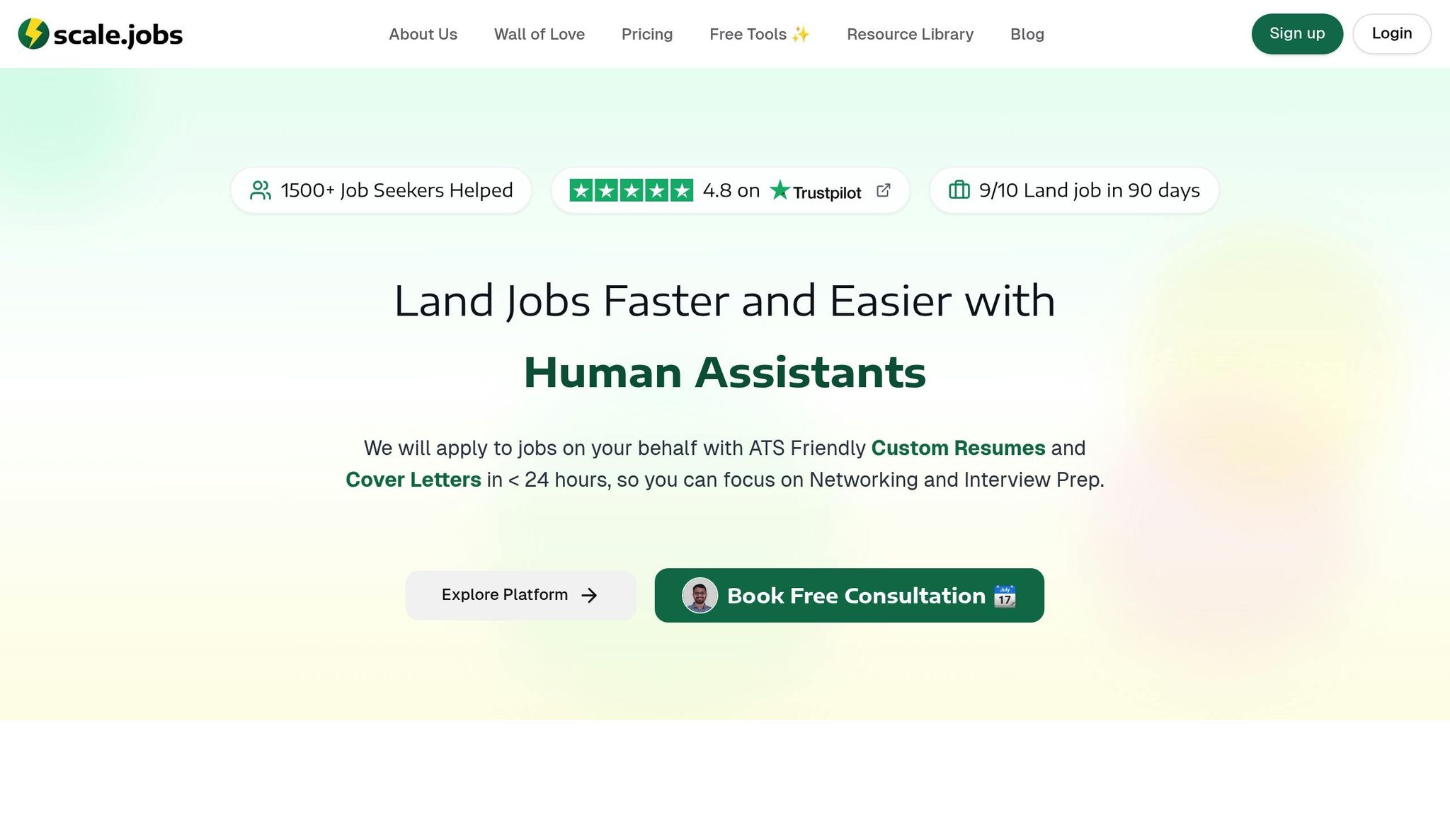
Eye-catching visualizations are great, but they won't land you the job if your resume can't make it past ATS systems or impress hiring managers. That’s where Scale.jobs steps in, offering a mix of ATS optimization and expert human guidance to help you showcase your skills effectively.
Tackling ATS Challenges with Scale.jobs
While impressive visuals can set you apart, they often trip up ATS systems, which struggle with resumes that include images or intricate formatting. This makes it tough for data professionals to highlight their visualization expertise. Scale.jobs solves this issue with an ATS-friendly resume builder. It ensures your resume is clean, scannable, and still emphasizes your visualization skills.
The platform also includes a free ATS checker that evaluates your resume against common screening software. You’ll get actionable feedback to make sure your resume gets through those initial automated filters.
Instead of embedding visuals directly, Scale.jobs guides you to describe your projects in a way that hiring managers and ATS systems can understand. For example, you might highlight how you built interactive dashboards that improved reporting efficiency by 40% or created real-time visualizations for customer data analysis. The platform’s AI assistant even customizes your resume for each job. Applying as a business analyst? It’ll emphasize your Power BI experience. Targeting a data science role? It’ll focus on your Python skills and relevant visualization libraries.
Human Expertise for Tailored Applications
Beyond technical fixes, Scale.jobs brings in human expertise to ensure your data skills translate into real business value. Their team reviews your visualization portfolio and crafts compelling application narratives. Instead of just listing technical details, they connect your work to measurable outcomes, like boosting key performance metrics or streamlining decision-making processes.
Every company has its quirks when it comes to applications - whether it’s specific file formats, portfolio links, or strict character limits. Scale.jobs’ virtual assistants handle these adjustments for you, ensuring your application meets each employer’s requirements. They also provide real-time support, making sure your visualization skills are presented in the best possible light.
Scale.jobs vs LazyApply vs Rezi.ai: Why Human Support Stands Out
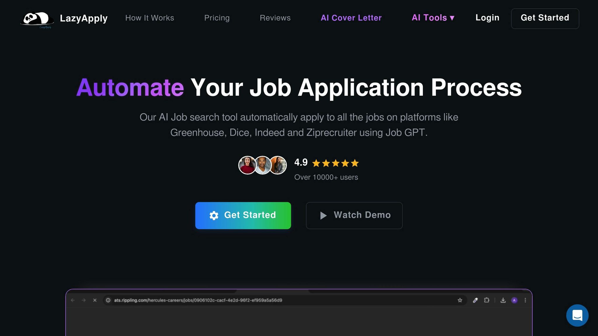
LazyApply prioritizes quantity over quality, automating mass applications that often fail to highlight your unique technical skills. Rezi.ai uses AI to optimize resumes and match keywords but struggles to turn technical projects into compelling stories.
Scale.jobs, on the other hand, takes a human-first approach that sets it apart:
- Portfolio Integration: Your visualization projects take center stage, with detailed descriptions tying technical skills to real business outcomes.
- Application Quality: Instead of generic, high-volume submissions, Scale.jobs focuses on personalized applications that showcase your standout achievements.
- Technical Precision: Human experts ensure your data visualization skills are accurately presented, avoiding the pitfalls of generic keyword stuffing.
What’s more, Scale.jobs offers a flat-fee pricing model, making it a cost-effective option for professionals in technical fields. With their comprehensive support, you can concentrate on networking and preparing for interviews while they handle the heavy lifting of your job applications. This human-focused approach is especially helpful for visa-dependent job seekers, who need their applications to be precise and timely from the very beginning.
Using Data Visualization to Land Your Next Job
In today’s job market, being able to transform complex data into clear, actionable insights is a game-changer. Data visualization skills are no longer just a nice-to-have; they’re a must-have for professionals across many industries. These skills not only highlight your technical expertise but also showcase your ability to solve problems - something every employer values.
Think about it: when you design dashboards that help executives make quicker decisions or create interactive reports that make team workflows smoother, you’re showing employers the kind of immediate impact you can deliver. But here’s the thing - having the skills isn’t enough. It’s all about how you present them.
To stand out, you need to frame your data visualization work in a way that speaks directly to hiring managers and applicant tracking systems (ATS). This is where Scale.jobs steps in, helping you translate your technical projects into clear, measurable achievements.
Here’s a tip: ATS systems don’t handle visuals well. Instead of embedding charts or graphs into your resume, describe your projects with quantifiable results. For example, highlight how your work led to faster decision-making or cut reporting times. These specific outcomes grab the attention of both automated systems and hiring managers.
Don’t stop at your resume, though. Showcase your visual projects on platforms like LinkedIn or in an online portfolio. This reinforces your ability to use analytics to drive results.
If you’re unsure how to present your work effectively, Scale.jobs can help. Their team provides expert guidance to turn your technical achievements into concise, results-driven narratives that pass ATS filters and appeal to hiring managers. They also focus on preparing you for interviews, ensuring you can clearly explain the business value of your work.
This approach is particularly helpful for data professionals, who often need to translate highly technical projects into terms that resonate with business leaders. Scale.jobs’ virtual assistants work with you to craft compelling stories that connect your skills to measurable outcomes, making your application stand out for all the right reasons.
FAQs
How can I add data visualizations to my resume without causing issues with Applicant Tracking Systems (ATS)?
Incorporating data visualizations into your resume can be a great way to make it stand out and emphasize your key achievements. But here's the catch: many Applicant Tracking Systems (ATS) struggle to process visual elements, so you need to proceed carefully.
Here are a few tips to balance creativity with ATS compatibility:
- Keep visuals minimal: Stick to simple charts or graphs that clearly illustrate measurable results, like sales increases or project milestones. Overloading your resume with visuals can do more harm than good.
- Add text for clarity: Pair your visuals with plain text descriptions. This ensures ATS systems can still interpret your achievements, even if they can't process the graphics.
- Have an ATS-friendly version ready: For online applications, submit a text-based resume in formats like PDF or Word that doesn’t include visuals. Save your visually enhanced version for networking events or in-person interviews.
If you’re unsure where to start, platforms like scale.jobs can help. They offer a free resume builder designed to create ATS-compliant resumes while still looking polished and professional. It’s a smart way to ensure your application gets noticed without getting stuck in the system.
What data visualization tools are best for transitioning into a data science role if I already have basic coding skills?
If you're stepping into a data science role and already have some basic coding skills, it's smart to explore tools that build on your technical foundation while improving how you present data. Tools like Tableau and Power BI let you create visually engaging dashboards and reports without needing to dive deep into coding. On the other hand, if you want to put your coding skills to work, Python libraries such as Matplotlib, Seaborn, and Plotly, or R packages like ggplot2, offer great flexibility for crafting custom visualizations.
The key is to pick a tool that fits your career aspirations and the industry you're aiming for. For example, Tableau and Power BI are popular in business analytics settings, whereas Python and R are often preferred in more technical or research-focused roles. Take advantage of free trials or open-source options to experiment and find the tool that works best for your goals.
What are the best ways to showcase data visualization projects on LinkedIn to catch the attention of potential employers?
To highlight your data visualization projects on LinkedIn effectively, aim for a polished and visually engaging presentation. Use posts featuring eye-catching visuals, like screenshots or links to interactive dashboards, to draw attention. In your post, provide a short explanation of the problem you addressed, the tools you utilized (such as Tableau, Power BI, or Python), and the results you achieved.
Take it a step further by adding these projects to your LinkedIn profile. Use the 'Featured' or 'Projects' sections to showcase them. Include a brief description, and whenever possible, link to live examples or your portfolio. This makes it easy for potential employers to assess your skills and accomplishments at a glance.
Don't forget to connect with your network by inviting feedback or sharing lessons learned during your process. This not only highlights your expertise but also fosters engagement, helping your work reach a broader audience.